Design is often thought of as a purely artistic profession. However, behind the sense of beauty and inspiration lies the need for designers to possess certain knowledge and skills in various fields. To work efficiently and productively, designers must understand their target audience. One of the most important studies helping designers to understand their users is psychology. Today, we will explore psychology’s role in the design and the psychological principles designers must remember during the design process.
The Role of Psychology in Design
The trend of user-centered design has made designers reconsider their approach to their work and go deeper into the understanding of their target audience. Donald A. Norman, in his book “The Design of Everyday Things,” defines design as an act of communication, which means deeply understanding the person with whom the designer is communicating. To better understand people’s needs, designers should consider the psychological principles of human behavior, aspirations, and motivations.
Designers who apply psychology in the creative process better understand their target audience. Psychological knowledge helps create designs that encourage users to perform the desired actions, such as purchasing or contacting the team.
Some designers may view psychology as a complicated approach to improving design and, as a result, neglect this part of research and analysis. However, designers do not need Ph.D. holders in psychology to use it effectively. They only need to consider the basic principles constantly presented in design. Based on our experience and conducted research, we’ve defined six effective psychological principles often applied in the design process.
Gestalt Principles
The Gestalt principles are an almost 100-year-old psychological theory that explores users’ visual perception of elements in relation to each other. “gestalt” means “unified whole,” so the theory shows how people tend to unify visual elements into groups. The principles on which users form groups include:
- Similarity: If users see objects that look similar, they may automatically perceive them as individual elements of one group. The similarity between elements is usually defined by shape, color, size, texture, or value. The similarity gives users a sense of coherence between the design elements.
- Continuation: This principle shows how the human eye moves naturally from one object to the other. This often happens through the creation of curved lines, allowing the eye to flow with the line.
- Closure: Closure is a technique based on the human eye’s tendency to see closed shapes. Closure works where an object is incomplete, but the user perceives it as a full shape by filling in the missing parts.
- Proximity: When objects are placed in close proximity, the eye perceives them as a group rather than seen individually, even if they aren’t similar.
- Figure/Ground: This principle demonstrates the eye’s tendency to separate objects from their background. Many pictures show two faces, depending on where your eye is focused, the object or the background.
The Gestalt principles confirm, in practice, that our brains tend to play tricks on us. Designers should consider this fact during the creation process to avoid misunderstandings.
Visceral Reactions
Visceral reactions come from the part of our head called the “old brain,” responsible for instincts. This kind of reaction often happens much faster than our consciousness does. Visceral reactions are rooted in our DNA and can be easily predicted.
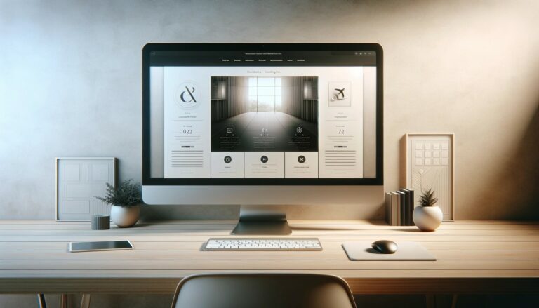
Designers use this knowledge to create a positive aesthetic impression with the design. It’s easy to guess what looks nice to people and what doesn’t if you know your target audience and their needs. The tendency to use beautiful high-resolution photos or colorful pictures on landing pages, websites, or any other web and mobile products is not accidental. By understanding users’ visceral reactions, designers can create designs that instantly captivate users and help them engage with the offered product or service.
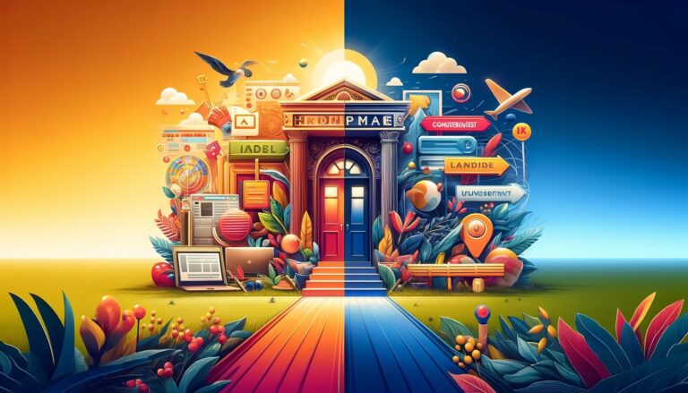
Psychology of Colors
The study of the psychology of colors is a scientific approach that investigates the impact of colors on human behavior, emotions, and reactions. This study suggests that colors significantly influence how people perceive and interact with their surroundings. In the design world, choosing colors that accurately represent the intended message and tone to the target audience is essential.
To assist in this process, here is a list of basic colors and the meanings commonly associated with them:
The following is a list of the basic colors and the meanings typically associated with them:
- Red: The color usually associates with passionate, strong, or aggressive feelings. It symbolizes good and bad feelings, including love, confidence, passion, and anger.
- Orange: An energetic and warm color that brings feelings of excitement.
- Yellow: This is the color of happiness. It symbolizes sunlight, joy, and warmth.
- Green: The color of nature. It brings calming and renewing feelings. It may also signify inexperience.
- Blue: It often represents corporate images. It usually shows calm feelings, but as a cool color, it also associates with distance and sadness.
- Purple: Long associated with royalty and wealth since many kings wore purple clothes. It’s also a color of mystery and magic.
- Black: The color has a great number of meanings. It associates with tragedy and death. It signifies a mystery. It can be traditional and modern. Everything depends on how you employ it and which colors go with it.
- White: The color means purity, innocence, wholeness, and clarity.
By choosing the right colors for a design, designers can create a mood, establish a brand identity, and communicate a message that resonates with users.
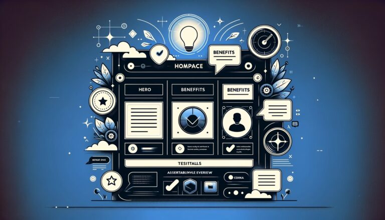
Recognition Patterns
Have you ever noticed that websites or applications united with one theme usually have common patterns in their design? The reason is the users’ psychology. People visiting a website or using an application expect to see certain things associated with the offered product or service.
For example, when visiting a barbershop’s website, users do not expect to see bright colors or pictures with cats or anything like this because such elements would make them think of the website as an untrustworthy resource.
Not only do colors and pictures matter, but some obvious and common things, such as a list of blog posts on the front page of a blog or the filters in an e-commerce website, are also essential for successful navigation. Users become accustomed to such things quickly, and their absence can make them uncomfortable.
Scanning Patterns
Before reading a web page, people often scan it to get a sense of whether they are interested. According to different studies, including the publications by Nielsen Norman Group, UXPin team, and others, there are several popular scanning patterns for web pages, among which “F” and “Z” patterns are the most common.
The “F” pattern is the most common eye-scanning pattern, especially for web pages with a large amount of content. Users first scan a horizontal line on the top of the screen, then move down the page and read along the horizontal line, which usually covers a shorter area. Finally, users scan a vertical line down on the left side of the copy to look for keywords in the initial sentences of the paragraphs. This pattern usually occurs on text-heavy pages like blogs, news platforms, thematic editorials, etc.
Before reading a web page, people often scan it to get a sense of whether they are interested. According to different studies, including the publications by Nielsen Norman Group, UXPin team, and others, there are several popular scanning patterns for web pages, among which “F” and “Z” patterns are the most common.
The “F” pattern is the most common eye-scanning pattern, especially for web pages with a large amount of content. Users first scan a horizontal line on the top of the screen, then move down the page a bit and read along the horizontal line, which usually covers a shorter area. Finally, users scan a vertical line down on the left side of the copy to look for keywords in the initial sentences of the paragraphs. This pattern usually occurs on text-heavy pages like blogs, news platforms, thematic editorials, etc.
The “Z” pattern is applied to pages not heavily concentrated on the copy. Users first scan across the top of the page, starting from the top left corner, looking for important information. Then, they go down to the opposite corner at a diagonal, finishing with the horizontal line at the bottom of the page, again from left to right. This is a typical scanning model for landing pages or websites not loaded with copy and not requiring scrolling down the page, which means that all the core data is visible in the pre-scroll area.
By understanding these patterns, designers can effectively place elements for users’ perceptions and help them perform expected actions.
Hick’s Law
Hick’s Law states that the more options users are exposed to, the longer it takes them to decide. This means that the more options you give users, be it products to choose from or pictures to look at, the more time and energy it takes to decide the next step of the interaction. This can lead to users making choices that result in unpleasant feelings after using the product, or, in the worst case, they may not want to make such a significant effort and leave.
Designers are recommended to keep any options, including buttons, pictures, and pages, to a minimum. Removing unnecessary choices makes the usability of the product more effective.
In conclusion, psychology is an effective tool in design that makes the creative process more productive while the result is more user-centered. We have discussed six useful principles, but they are only the tip of the iceberg. There is much more to learn on the topic, and we encourage readers to explore further.
By applying psychology in design, designers can create effective designs that resonate with users, establish brand identity, and communicate messages that lead to positive user experiences.