In digital marketing, landing pages are the unsung heroes of conversion optimization. A well-crafted landing page can decide whether a visitor will take the desired action or abandon the journey altogether. Unlike general websites, landing pages are designed with a single focus or goal, called to action (CTA). However, achieving a high conversion rate isn’t just about what you present; it’s about how you present it. The structure and sections of your landing page play a critical role in effectively guiding visitors through your conversion funnel.
This guide will walk you through a high-converting landing page’s essential elements and structure. Understanding and implementing these core components will unlock the secret to turning visitors into leads or customers, boosting conversion rates, and achieving marketing goals.
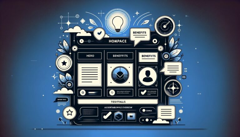
1. The Above-the-Fold Content
The First Impression
The above-the-fold content is what visitors see without having to scroll down the page. This section makes the crucial first impression and must immediately engage visitors. It should communicate who you are, what you offer, and why it matters to your audience. Given its importance, the above-the-fold content must be meticulously crafted to grab attention and encourage further exploration.
Key Components
- Headline: Your headline should be clear, concise, and compelling. It must capture the essence of your offer and make visitors want to learn more.
- Subheadline: A supporting subheadline can provide additional details or emphasize a key benefit of your offer. It should complement the headline and draw the visitor deeper into your message.
- Primary Call-to-Action (CTA): Your main CTA should be prominent and persuasive, encouraging visitors to take the next step, whether that’s signing up, making a purchase, or downloading a resource. The CTA button should stand out visually and be placed in an intuitive location.
- Engaging Visuals: High-quality images or videos that resonate with your target audience can significantly enhance the appeal of your landing page. Visuals should support the message and not distract from it, potentially increasing the visitor’s emotional connection to your offer.
Best Practices
To maximize the impact of your above-the-fold content, ensure it’s visually striking and easy to digest. Use clear, benefit-driven language and visuals that align with your audience’s expectations and interests. This section should make it immediately evident what action you want the visitor to take, guiding them smoothly toward your desired conversion goal.
Certainly! Let’s expand on Section 2, the Unique Value Proposition (UVP), adding more content after the bullet points to enrich the discussion and provide a more comprehensive understanding.
2. Unique Value Proposition (UVP)
Defining Your UVP
The Unique Value Proposition (UVP) acts as a clarion call that distinguishes your offering from others in the marketplace. It succinctly articulates the unique benefits and value your product or service delivers, answering the critical question of why a visitor should choose you.
Crafting a Compelling UVP
- Focus on Benefits: Your UVP should spotlight the benefits your product or service brings to the customer, going beyond mere features to showcase real-world value.
- Be Specific: Specificity in your UVP removes ambiguity, making it clear exactly what makes your offer stand out. This clarity helps potential customers understand why your solution best fits their needs.
- Clarity is Key: Your UVP should be immediately understandable, avoiding industry jargon or complex language that could alienate your audience.
After establishing the critical points for crafting a compelling UVP, it’s crucial to integrate this proposition into every aspect of your landing page. The UVP is not just a statement to be placed at the top of the page and then forgotten; it should be a theme that resonates throughout every section, reinforcing the value you offer to the visitor. This means that every piece of content, from headlines to CTAs, should echo the promise made in your UVP, creating a cohesive and persuasive narrative that guides the visitor toward conversion.
Moreover, the UVP should be visually distinct within the landing page layout, using bold text, contrasting colors, or multimedia elements like icons or videos to ensure it stands out. Remember, the goal of the UVP is not just to inform but to resonate with the visitor on an emotional level, making them feel that choosing your offer is not only logical but inevitable.
By carefully crafting and prominently displaying your UVP, you set the stage for a landing page that effectively communicates the unique benefits of your offer, compelling visitors to engage further with your content and, ultimately, convert.
Benefits and Features
Highlighting What You Offer
After grabbing attention with your UVP, the next step is to delve into the specifics of what you offer through a detailed exposition of benefits and features. In this section, you make a compelling case for your product or service, underlining how it stands out in solving your customers’ problems or enhancing their lives.
Presentation Matters
- Use Bullet Points: Organize the key benefits and features into bullet points or short, digestible paragraphs, allowing quick scanning.
- Prioritize Benefits: Benefits should be presented front and center, as they directly address the visitor’s question of “What’s in it for me?” Features can follow, providing the “how” behind the “what.”
- Visuals and Icons: Incorporate relevant visuals or icons to break up text blocks, making the section more engaging and easier to understand.
Following these principles ensures that your benefits and features are communicated effectively. However, it’s also essential to understand that this section is more than just a list; it’s an integral part of the narrative that propels the visitor through your landing page. Each benefit and feature should reflect your UVP, reinforcing your offer’s unique value.
To achieve this, consider framing each benefit with a relatable scenario or challenge your target audience faces, followed by a concise explanation of how your product or service provides the solution. This approach illustrates the practical application of your offer and helps forge an emotional connection with your audience by showing empathy and understanding of their needs.
Moreover, it’s beneficial to intersperse customer testimonials or case studies within or immediately following this section. Such social proof can validate claims about your benefits and features, demonstrating real-world success stories and further building trust with prospective customers.
In essence, the Benefits and Features section should bridge the initial attraction created by your UVP and the conviction needed to move visitors toward action. By carefully structuring this section to be informative, persuasive, and relatable, you can effectively guide visitors down the conversion path, providing them with all the information they need to make an informed decision.
Social Proof and Testimonials
Building Trust Through Social Proof
In a digital world where trust is paramount, social proof is a critical bridge between skepticism and trust. Leveraging social proof through customer testimonials, reviews, and endorsements can amplify your landing page’s persuasiveness, showcasing real-world applications and satisfaction with your product or service.
Best Practices for Testimonials
- Authenticity is Crucial: Authentic testimonials resonate more deeply than polished endorsements. To add legitimacy, use honest feedback from satisfied customers, including their names, positions, or locations.
- Highlight Specific Outcomes: Testimonials that detail specific benefits or measurable outcomes from using your product or service are particularly effective. They transform abstract benefits into tangible results.
- Diverse Perspectives: Showcasing a range of testimonials from different customer segments or use cases can broaden the appeal of your offer, demonstrating its versatility and wide-reaching impact.
Expanding on the role of social proof further, this landing page component should be strategically positioned to reinforce the decision-making process. Ideally, testimonials should follow the sections detailing your UVP and the benefits and features of your offer. Once visitors understand what you offer and why it matters, this placement ensures they receive immediate confirmation from others who have experienced the value firsthand.
Moreover, incorporating various forms of social proof can enhance its impact. Beyond written testimonials, consider including video testimonials, case studies, “as seen in” media logos, and real-time statistics (such as customer count or satisfaction ratings). These varied forms of social proof cater to visitor preferences, ensuring something resonates with everyone.
Another effective strategy is to address potential objections within your testimonials. You can proactively reassure visitors by selecting testimonials that counter common hesitations or doubts. For instance, if price is a common concern, a testimonial highlighting your product’s exceptional value or ROI can be particularly persuasive.
Finally, remember that integrating social proof aims to showcase that others have successfully used your product or service and to illustrate how it has made a significant difference in their lives or businesses. Each testimonial should contribute to a narrative of transformation and success, compelling prospective customers to envision themselves achieving similar results.
Calls to Action (CTAs)
Directing Visitors Toward Conversion
The Call to Action (CTA) is the climax of your landing page’s narrative. This is where you ask your visitors to take a specific step, be it signing up, purchasing, or any other conversion goal. A CTA’s effectiveness goes beyond words; it encompasses design, placement, and psychological triggers that collectively motivate action.
CTA Design and Placement
- Visibility: A CTA must stand out from the rest of the page, often through contrasting colors or a size that draws the eye. Its placement should be intuitive, where visitors naturally conclude they can take the next step.
- Action-Oriented Language: Phrases like “Get Started,” “Sign Up Now,” or “Access Your Free Trial” clearly communicate the action you want visitors to take, imbuing the CTA with a sense of urgency and benefit.
- Minimize Friction: The path from clicking the CTA to completing the action should be seamless and straightforward. Avoid redirecting visitors through multiple pages or asking for excessive information that might deter them.
Expanding upon these key points, it’s vital to understand that your landing page can (and often should) have multiple CTAs, particularly if it’s long or covers various aspects of an offer. However, each CTA should be consistent in message and design, reinforcing the singular action you desire from your visitors.
Diversifying the presentation of your CTAs can also cater to different visitor preferences and behaviors. For instance, a sticky CTA that remains visible as the visitor scrolls can capture attention without intruding, while an animated CTA might catch the eye of those skimming through the content.
The psychology behind an effective CTA cannot be overstated. Phrasing that creates a sense of urgency or exclusivity (“Limited Offer,” “Join an Exclusive Community”) can significantly increase conversion rates. Similarly, CTAs that offer something of immediate value (“Download the Free Report”) can be more compelling than those requiring a more significant commitment upfront.
Personalization is another advanced strategy for enhancing CTA effectiveness. Tailoring the CTA message based on the visitor’s previous interactions with your site or segmenting CTAs based on different target audiences can lead to higher engagement and conversions.
Testing various aspects of your CTA, including its wording, design, and placement, is critical. A/B testing can reveal insights into what resonates best with your audience, allowing you to optimize for maximum conversions.
Lead Capture Forms
Simplifying the Path to Conversion
Lead capture forms are a pivotal element of many landing pages, serving as the mechanism through which visitors provide information in exchange for something valuable, like a free trial, a whitepaper, or a product demonstration. The design and complexity of these forms can profoundly impact conversion rates. Simplifying the path to conversion through thoughtful form design is crucial.
Key Considerations for Form Design
- Ask Only What’s Necessary: Every additional field in a form increases the user’s effort, potentially lowering conversion rates. Limit questions to those essential for the next step in your sales or marketing process.
- Use Progressive Disclosure: If more information is needed, use progressive disclosure techniques. In these techniques, additional fields are revealed only if relevant based on the user’s previous answers. This keeps the initial view of the form simple and less daunting.
- Optimize for Usability: Design forms for ease of use. This includes clear labels for each field, logical grouping of related information, and visible error messages that help users correct mistakes effortlessly.
Beyond these structural elements, the psychological aspect of form design plays a significant role in encouraging submissions. This involves:
- Reassuring Privacy: Include a brief privacy statement near the submission button, reassuring visitors that their information will be confidential and used responsibly.
- Offering Incentives: Clearly state the value that completing the form provides, such as access to exclusive content, a free trial, or a consultation. This value proposition should be compelling enough to outweigh any hesitation about providing personal information.
- Using Action-Oriented Submit Buttons: The submission button’s language can influence conversion rates. Instead of a generic “Submit,” use action-oriented language that reflects the benefit, like “Get Your Free Report” or “Start My Free Trial.”
The positioning of lead capture forms on your landing page also matters. Placing them after compelling content highlighting the value of what’s being offered can increase the likelihood of completion. Moreover, visually distinguishing the form area with contrasting colors or an enclosing box can draw attention and guide the user toward the action you want them to take.
Finally, testing different variations of your form can provide valuable insights into what works best for your audience. A/B testing different layouts, field configurations, and CTA texts can help identify the most effective combination for maximizing conversions.
Mobile Optimization and Responsiveness
Catering to the Mobile Audience
In an era where mobile internet usage surpasses desktop, optimizing landing pages for mobile devices is not just beneficial—it’s essential. Mobile optimization ensures visitors accessing your page from smartphones and tablets have an experience tailored to the smaller screen size, touch interactions, and mobile browsing contexts.
Essentials of Mobile-Friendly Design
- Responsive Design: Your landing page should automatically adjust to fit the screen size and orientation of the device it’s being viewed on. Responsive design improves readability and usability, ensuring text, images, and CTAs are visible and navigable on any device.
- Fast Loading Times: Mobile users often browse on the go, so they’re less patient with slow-loading pages. Optimize images, leverage browser caching, and minimize code to increase loading speed.
- Simplified Navigation: Complex menus on mobile can be frustrating to navigate. To conserve screen space, simplify your navigation to include only the most essential links, and consider a hamburger menu.
- Touchable CTAs: CTAs should be easy to tap with a finger without the risk of hitting the wrong button. Ensure that buttons are sized sufficiently and spaced apart from other touchable elements.
Beyond these technical aspects, the content and layout of your mobile landing page should also be considered. Mobile screens offer less space for content, which means prioritizing the most important information and ensuring it appears above the fold. Simplify your message and offer to capture and retain attention in a mobile context.
Enhancing Mobile User Experience
- Use of White Space: Ample white space around elements can make your mobile landing page feel less cluttered and more enjoyable to navigate.
- Legible Text: Ensure your text is easily readable on small screens without zooming. This may mean using larger font sizes and line heights for mobile devices.
- Interactive Elements for Engagement: Incorporate interactive elements like swipeable galleries or collapsible sections to engage mobile users and provide a dynamic browsing experience.
Testing is a crucial step in mobile optimization. Regularly review your landing page on various devices and browsers to ensure it offers a consistent and positive user experience. Use mobile-specific features, such as click-to-call buttons for phone numbers, to leverage mobile devices’ unique capabilities and use cases.
Visuals and Media
Enhancing Engagement through Visual Content
Visual elements are pivotal in capturing attention, conveying information quickly, and enhancing the user experience on a landing page. Properly chosen and strategically placed visuals can increase engagement and conversion rates by making the page more appealing and easier to understand.
Key Types of Visual Content
- High-Quality Images: Use crisp, high-resolution images relevant to your content. Whether they depict your product, service, or the benefits of your offer, images should support the narrative and encourage visitors to take action.
- Videos: Videos can be incredibly persuasive, offering a dynamic way to showcase your product or service. A short, compelling video can convey complex information succinctly, making it an effective tool for increasing conversions.
- Infographics and Icons: Infographics can distill complex data or processes into an easy-to-understand visual format, while icons can highlight key benefits or features, making the content more scannable.
Best Practices for Using Visuals
- Align with Your Message: Every visual element should serve a purpose and reinforce the message of your landing page. Avoid using visuals merely as decoration.
- Optimize for Load Time: While visuals are important, they shouldn’t compromise the page’s loading speed. Optimize images and videos for the web to ensure they load quickly without sacrificing quality.
- Consider Placement: The placement of visuals can impact their effectiveness. Place key images and videos near relevant text or CTAs to highlight the most important content or actions.
Beyond static images and videos, interactive media like virtual tours, 360-degree product views, or interactive demos can provide an immersive experience, encouraging users to engage with your content more deeply. These media types can be particularly effective for complex products or services, allowing visitors to explore features in detail at their own pace.
Leveraging Visuals for Emotional Connection
Visual content has the power to evoke emotions, making it a crucial tool for creating a connection with your audience. Use visuals that reflect your target audience’s aspirations, needs, or pain points to foster an emotional bond and drive them toward conversion.
For example, lifestyle images showing happy, satisfied customers using your product can instill a sense of desire and belonging. At the same time, before-and-after visuals can effectively demonstrate your service’s transformative impact.
Testing different types and placements of visual content can help you understand what resonates most with your audience, allowing you to fine-tune your approach for maximum impact.
Footer Section
The Anchor of Your Landing Page
While often overlooked, the footer of a landing page acts as the anchor, providing visitors with additional resources, information, and navigation options. A well-designed footer can enhance the user experience, reinforce trust, and increase conversion rates by offering visitors a last engagement point with your brand.
Essential Elements to Include in the Footer
- Contact Information: Make it easy for visitors to find ways to contact you. Include your phone number, email address, and physical location if applicable. This transparency builds trust and offers reassurance to potential customers.
- Navigation Links: While the primary focus of a landing page is to drive conversions, providing links to other important sections of your website (such as About Us, Blog, or Support) in the footer can be beneficial for visitors seeking more information.
- Social Media Icons: Include icons that link to your profiles on your social media pages to encourage visitors to connect with your brand. This builds community and offers an alternative channel for visitors to stay engaged with your brand.
- Privacy Policy and Legal Information: Privacy concerns are paramount in today’s digital age. Include links to your privacy policy and legal disclaimers to demonstrate your commitment to visitor privacy and compliance with regulations.
Designing a Footer That Complements Your Landing Page
The footer’s design should be consistent with the overall aesthetic of the landing page, though it can be more subdued to avoid distracting from the main conversion goal. Use colors and fonts that align with your brand identity, but opt for a simpler layout that clearly organizes the footer elements.
Leveraging the Footer for Additional Conversions
While the footer is at the bottom of the page, it can still drive conversions. Consider including a secondary call-to-action, such as signing up for a newsletter or following your brand on social media. This offers visitors who may not be ready to make a primary conversion action another way to engage with your brand.
Additionally, the footer is an excellent place to showcase any awards, certifications, or memberships that further establish the credibility and authority of your brand. These elements can reassure visitors of your expertise and quality, leaving a lasting impression as they conclude their visit to your landing page.
Conclusion
Crafting a landing page that converts isn’t just about having the right elements; it’s about creating a harmonious and persuasive journey for your visitors. From the moment they arrive, guided by the compelling allure of your above-the-fold content, to the final considerations made at the footer of your page, each section plays a crucial role in the conversion narrative.
Our journey through the essential sections of a high-converting landing page—from the immediacy of the hero section and the clarity of the unique value proposition, through the persuasive power of testimonials and the direct call to action, down to the reassurance offered by the footer—illustrates a strategic approach to digital persuasion. Each element is a thread in a larger tapestry, designed not just to attract but to engage and convert your audience.
Remember, the ultimate goal of your landing page is to make the path to conversion as clear and compelling as possible. This requires a balance of design, content, and user experience, working together towards a single objective. But beyond the mechanics and best practices, the soul of a high-converting landing page lies in its ability to connect with visitors on a human level, addressing their needs, aspirations, and hesitations with empathy and understanding.
As we conclude this guide, let’s reiterate the importance of testing and optimization. The digital landscape is ever-evolving, and so are your audience’s expectations. Continuous testing, learning, and iterating are key to maintaining and improving your landing page’s effectiveness. Engage with your analytics, listen to your audience, and be prepared to adapt. Your landing page is a living component of your digital marketing strategy, with the potential to grow and evolve in response to your insights and discoveries.
Unlocking high conversion rates is an ongoing journey of refinement and engagement. With the strategies and insights outlined in this guide, you can create landing pages that capture attention and convert it into meaningful action. Here’s to crafting experiences that resonate, engage, and ultimately convert.